

You have about fifty milliseconds. That is the window, according to the Nielsen Norman Group, in which a visitor forms a gut-level impression of your website before a single word has registered. Not five seconds, not one. Fifty milliseconds, roughly the time it takes to blink. In that sliver of a moment, a person decides whether your business looks credible, whether it looks like it understands them, and whether it is worth their attention at all.
For most small businesses, this is where the money is won or lost. And it is why high-converting website design has very little to do with looking trendy, and almost everything to do with making the right thing obvious at the right moment.
We think about this constantly at The Creative Stable, because the sites we build are not digital brochures. They are meant to ring a phone and fill an inbox. Two of our recent launches show, in very different registers, what that actually looks like in practice. One is a law firm that has been operating since the Eisenhower administration. The other is a newly introduced home-staging studio. They could not look more different, and yet they convert for exactly the same reasons.
Lesson One: Great Website Design Removes the Distance Between Curiosity and Contact
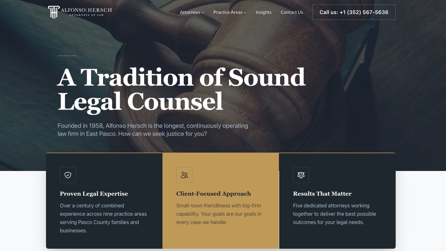
Land on the homepage of Alfonso Hersch, P.A., a law firm rooted in Dade City and Zephyrhills, Florida, and the first thing you notice is what you do not have to hunt for. The phone number sits in the header and stays there as you scroll. It is not a graphic. It is a tappable, click-to-call link, which matters more than it sounds. Google’s research found that fifty-three percent of mobile visitors abandon a site that takes longer than three seconds to do what they want. Friction of any kind, including a phone number you have to copy by hand, is a quiet conversion killer.
So the firm’s site refuses to make anyone work. The opening line, “A Tradition of Sound Legal Counsel,” is followed by a single human question: “How can we seek justice for you?” Below it sit three plain promises, proven expertise, a client-focused approach, and results that matter, each backed by one line of proof rather than a paragraph of throat-clearing. The visitor is never more than one scroll away from a way to reach a real person. The number reappears in both office blocks, in the footer, and again in the closing banner, which reads “A Century of Experience, One Call Away.”
That repetition is deliberate. Conversion does not happen at a single hero moment; it happens whenever the visitor finally feels ready, and you cannot predict when that will be. So you put the door everywhere.
Lesson Two: Good UX Design Means Fewer Choices, Not More
There is a temptation, especially among businesses proud of everything they offer, to put all of it on the screen at once. Strong UX design resists that urge. The navigation on the Alfonso Hersch site is four items, not fourteen. Attorneys, practice areas, insights, contact. Everything a prospective client needs, nothing they have to decode.
The data is unusually direct on this point. When Unbounce analyzed more than eighteen thousand landing pages, the ones that pointed visitors toward a single, clear call-to-action converted at 13.5 percent, while pages cluttered with five or more competing links fell to 10.5 percent. Every extra option you add is a small tax on the visitor’s attention, and attention is the one thing you cannot get back.
This is the discipline behind high-converting website design that most people never see, because it shows up as the absence of clutter rather than the presence of features. The hard part is not adding; it is deciding what to leave out. A site that tries to say everything ends up converting on nothing.
Lesson Three: People Decide With Their Gut, So Your Website Design Has to Speak to It
If the law firm proves the case for clarity and authority, our work for StageWell Design Co. proves something quieter and just as important. Conversion is emotional before it is rational.
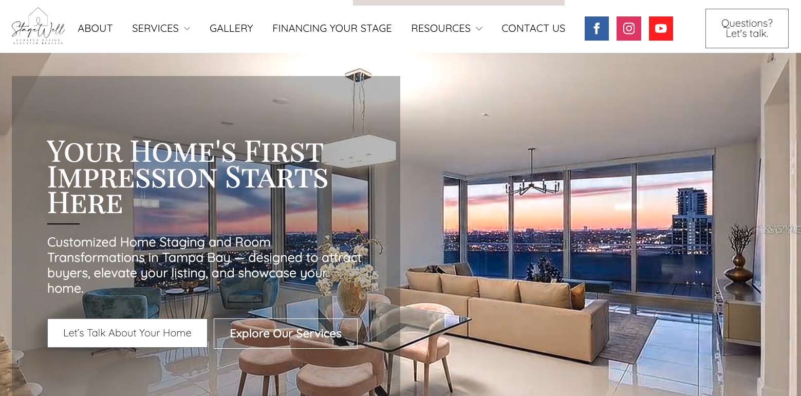
StageWell is the home-staging studio of Bobbie Donaldson and Mary Turnes, a powerhouse staging design duo, and their site opens not with their résumés but with a feeling the reader already recognizes: “Customized Home Staging and Room Transformations in Tampa Bay — designed to attract buyers, elevate your listing, and showcase your home.” There is no doubt what they offer in the first blink of a new visitor. You are not reading about a company. You are listening to people who clearly understand the specific anxiety of trying to sell a house.
The instinct is well founded. The National Association of Realtors’ 2025 Profile of Home Staging found that eighty-three percent of buyers’ agents said staging made it easier for a buyer to picture a property as their future home, and nearly half reported it shortened time on the market. StageWell’s website does for their business exactly what staging does for a house. It removes the noise, makes the value obvious, and lets the visitor imagine what working with them would feel like.
Their service path is just as uncluttered: a consultation, then a custom staging plan, then the staging and styling itself. Three steps, in plain language, each one ending in a reason to reach out. It is the same conversion logic as the law firm, dressed in completely different clothes. Make the next step the easiest thing on the page.
Lesson Four: Proof Does the Selling Your Copy Cannot
Notice what neither site asks the visitor to take them on faith. The law firm lines its homepage with credential badges from the Florida Bar and regional legal associations, alongside the kind of longevity claim, operating continuously since 1958, that a competitor simply cannot copy. StageWell leads with the emotional and financial stakes of getting a sale right, and a showcase of their work that sells itself.
This is social proof doing the heavy lifting, and the effect is measurable. Researchers at Northwestern University’s Spiegel Research Center found that displaying as few as five reviews can raise the likelihood of purchase by 270 percent. People believe other people, and they believe verifiable credentials, far more readily than they believe a brand describing itself. The best website design makes that proof impossible to miss without making it loud.

What It All Adds Up To
High-converting website design is not a style. It is a set of decisions made on the visitor’s behalf, so they never have to think about how to take the next step. Put the contact method everywhere and make it clickable. Cut the navigation down to what matters. Lead with feeling, then back it with proof. Treat every scroll as another chance to open a door rather than another chance to impress.
A law firm and a home staging company arrived at the same destination by very different routes, which is the whole point. The principles travel. They work for the business that has been around for 68 years and for the new one built around two talented people, because they are really principles about human attention, not about any one industry.
That is the work we care about most, building sites that earn the call and the email rather than just collecting compliments. If you want to see how we approach it, our website design and branding services lay out the process. And when you are ready to talk about what your own site could be doing for you, let’s connect. The first fifty milliseconds are too valuable to leave to chance.